Bigger is better! Pro Tooltips for the Avid Home Hunter
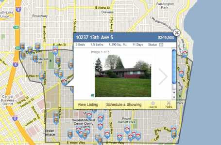
My first project after the dust settled from walking through the doors of Estately was to redesign and enrich the user experience of the property bubble. The property bubble is a super charged snap shot of information about a house or condominium that is revealed upon “click” of a map marker on the Estately search results map.
Goals for the Redesign.
The Estately team envisioned taking our current map of search results a few steps further, giving users an image carousel to preview while browsing the map in addition to the essential home facts. That’s right…a carousel of images and 30% bigger than the previous thumbnail we were loading in our prior release.
The supporting home details and functionality are there too and not at the expense of the imagery either. The developers did a wonderful job making everything load just as speedy as before. Now users have access to more imagery, highly scannable facts such as price, beds, bath, square feet, days on market and sale status. Top that with functionality to view the full listing, schedule a showing and save/hide the property and you have a hard working area of pixels.

var perfection == calculatedGuess + test + userFeedback + iteration
Striving for perfection is a good trait to have but it can also paralyze you too. The team here believes in rapid prototyping and deploying features to users as quickly as possible. This process is not at the expense of design but rather in tandem with development. Honestly, anything can be made to look sweet in Fireworks or Photoshop but until it’s in the browser and being used it’s just a pile of pixels. We’ve already made improvements since the property bubble redesign launched and more are on the way so stay tuned.
Process. Right brained design thinking.
Mapmaking is an ancient art-form that I believe stems from the human desire to understand everything around us. Some maps help you find a home , while others are self portraits .
While the map medium has traveled the spectrum from sheepskin to pixels the fundamentals remain consistent, maps can tell the reader something about their origin, destination and the places in-between.
Crystal balls, tarot cards and carousels
Half the time we are engineering, designing and directly caring for our customers to keep the product alive an nurtured. The other half of the day is spent in a smokey room with witch craft and sorcery chants echoing from our think tank chambers.
Seriously, we really care about helping people find homes and think of our end users as the modern day explorers akin to “X”. Part of that love is about rethinking the way people find home online. So, we have to crystal ball it’, dream and take little leaps of calculated guesses when expanding the product feature set. This is where the image carousel came to life. Why not offer users multiple photos at the map level and make this view harder working.
Listening and responding to user feedback
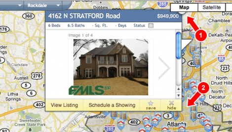
Now we listen and watch our users and we insert our perfection variable from time to time and incrementally improve the feature. Last week Doug and I got an email from a user who loves our site but was frustrated with the new property bubble. My ears perked up and I immediately wanted to understand and correct her pain. Well it turns out that she was confused about how to close the bubble, especially when the “close” button was obscured with other UI elements.
Check out this diagram I sent her back to make sure I understood her problem.

User feedback is like panning for gold and this was a huge nugget. So, here our close button for the property bubble is hidden underneath the Google Maps UI. Well it just so turns out our current “Hide” button has the same icon as the close button and being located in the lower corner of the bubble it makes perfect sense our user clicked on it hoping to “hide” or close the bubble.
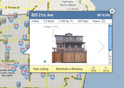
In the short term the fix was easy, swap the “Save” and the “Hide” buttons. This is truly a part of my craft I value deeply. Not every piece of end user feedback is as helpful as the next but having a channel open for the feedback to reach me is invaluable.
In the near future, we will be changing how the “hide” feature works a little more significantly.
Keep on keepn’ on
Design, code, test and listen. Be on the look out for more updates from behind the Estately.com curtain. This first release tackled homes and we have some surprises for the condo hunters out there too, so stay tuned for a follow-up post.
*Also note we are working hard to make sure every listing has images if they are available from the respective MLS.
